OpenGov
Next Gen Reports
Design a scalable replacement for our reporting tool to help governments analyze, understand, and share data.
Basics
Problem
Our tool for reporting was actually 3 very different tools taped together. Each originally intended for very specific use-cases like light exploration of financial summaries. As time went on it was pushed around, stretched, and shoved into use-cases it wasn't designed or built to scale to. And so we decided to invest in a refactor of the tech and the UX.
Rebuilding mature products takes years. So our charter was to set up architecture and frameworks that could scale from the knew to the new.
No pressure.
Role
- Research
- Prototyping
- Interaction Design
- Visual Design
Goals
- A consistent, unified experience
- Speak the user’s language
- Prioritize flexibility and scale
Process
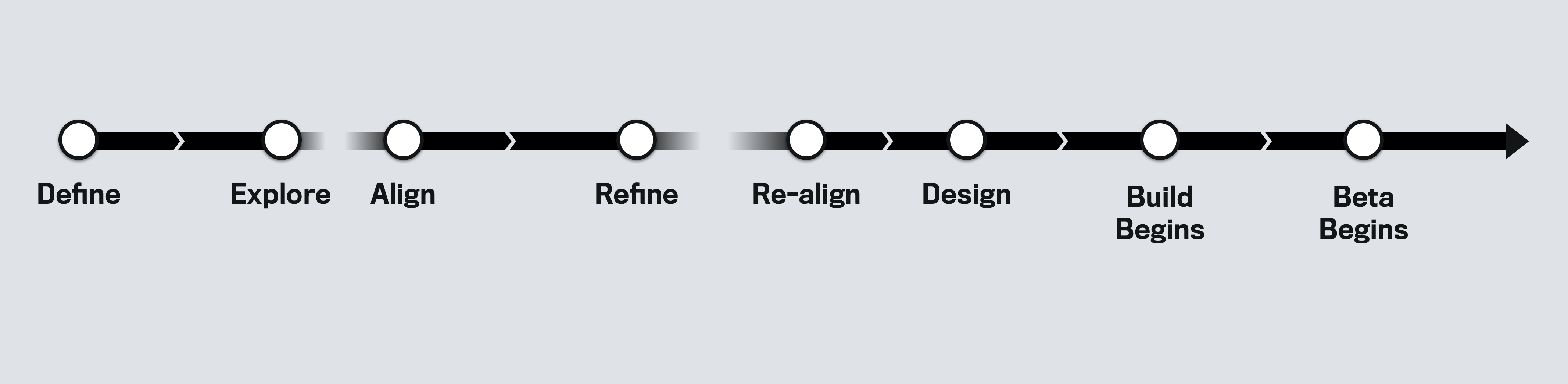
The organizational focus needed for an application refactor was hard to get and hard to keep. The program stalled a few times and shifted priority areas, all while a game of teammate musical chairs was happening in the background.
Research Insights
Because of the long lead time we were able to do consistent research and exploration with customers and customer success.
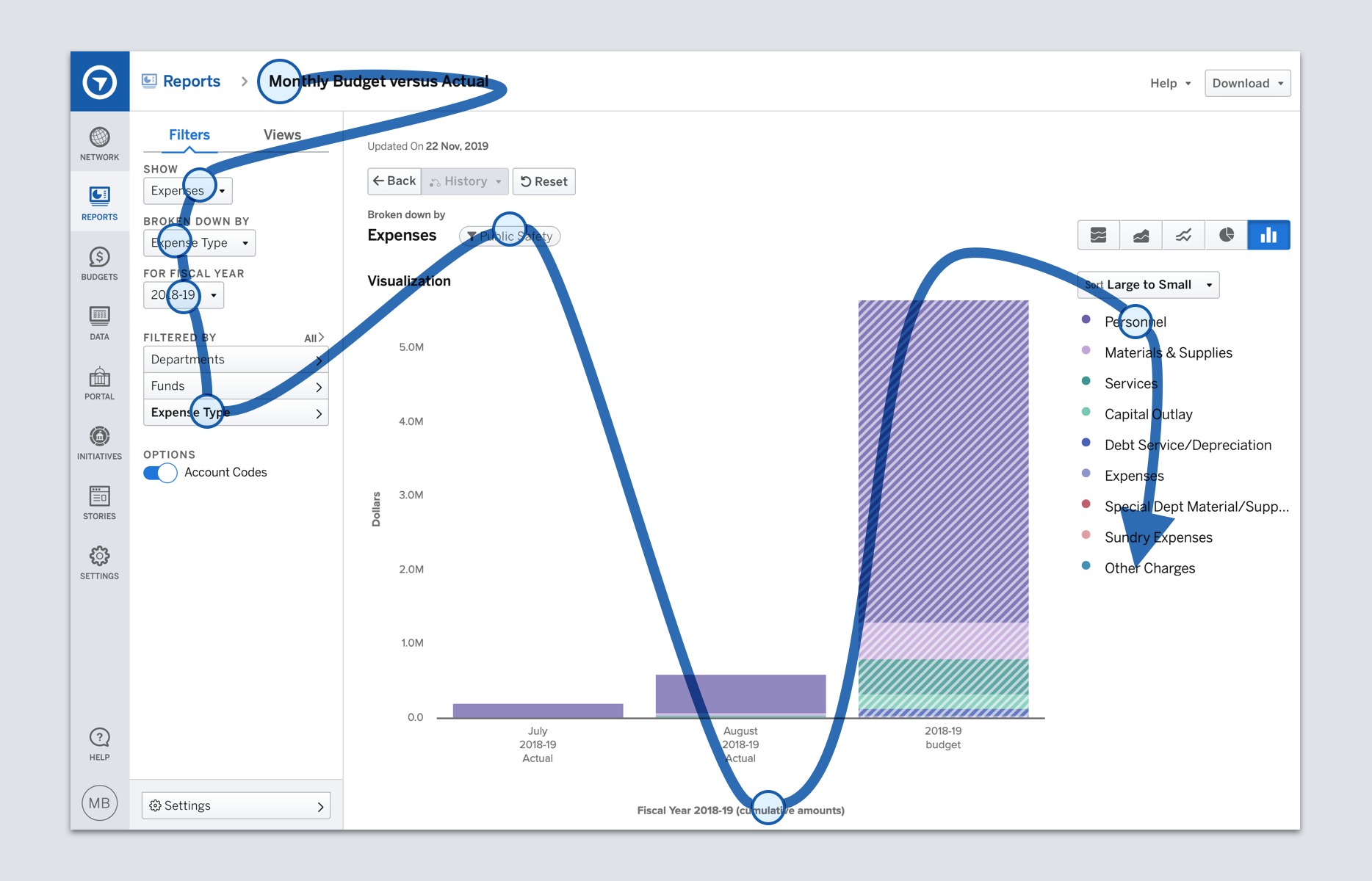
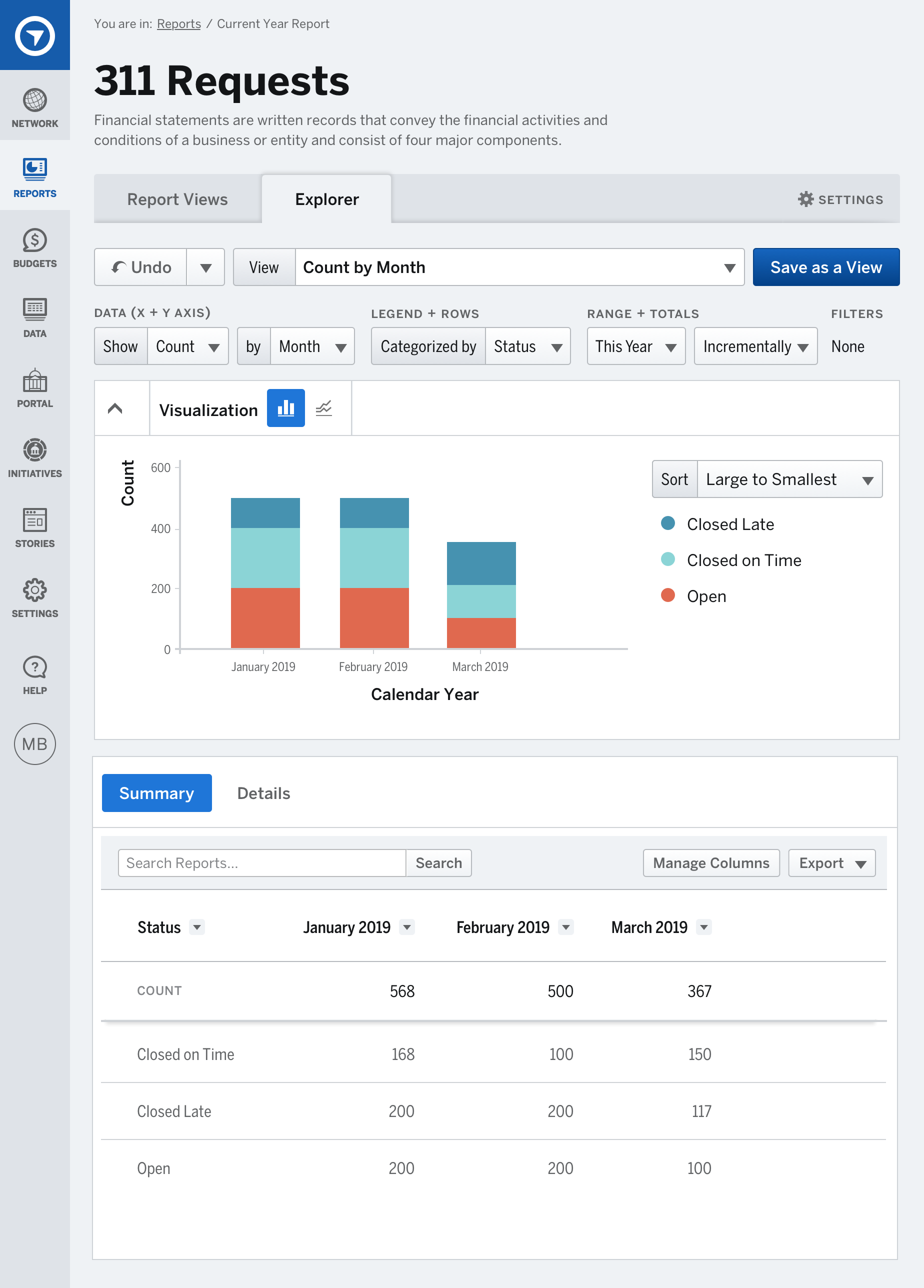
What am I looking at?
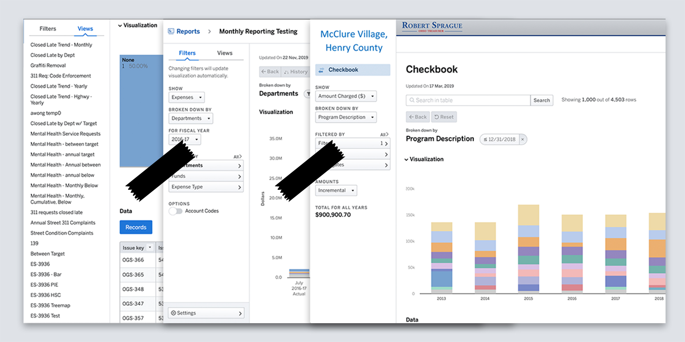
The key clues to understand a report were scattered across the screen, and sometimes even hidden.
Analysis Paralysis
In the real world reports are paper, locked in, official. In OpenGov reports were always in an editable state, bells and whistles abounded. Customers missed some of the fixed elements of their old world.
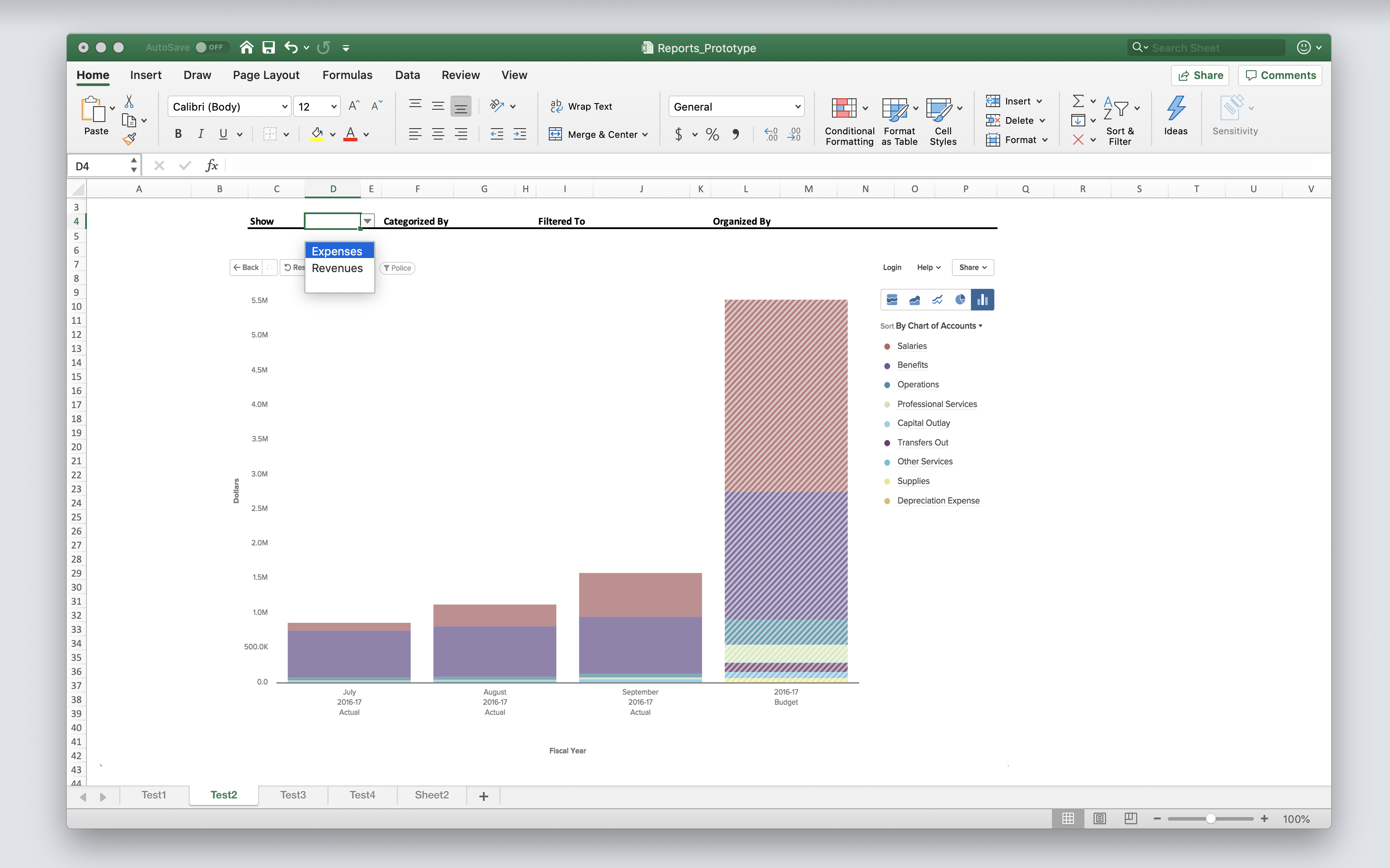
Everyone wants to be a designer
Over and over we heard customers request the ability to control more of the presentation of their graphs and tables.
Do you understand me?
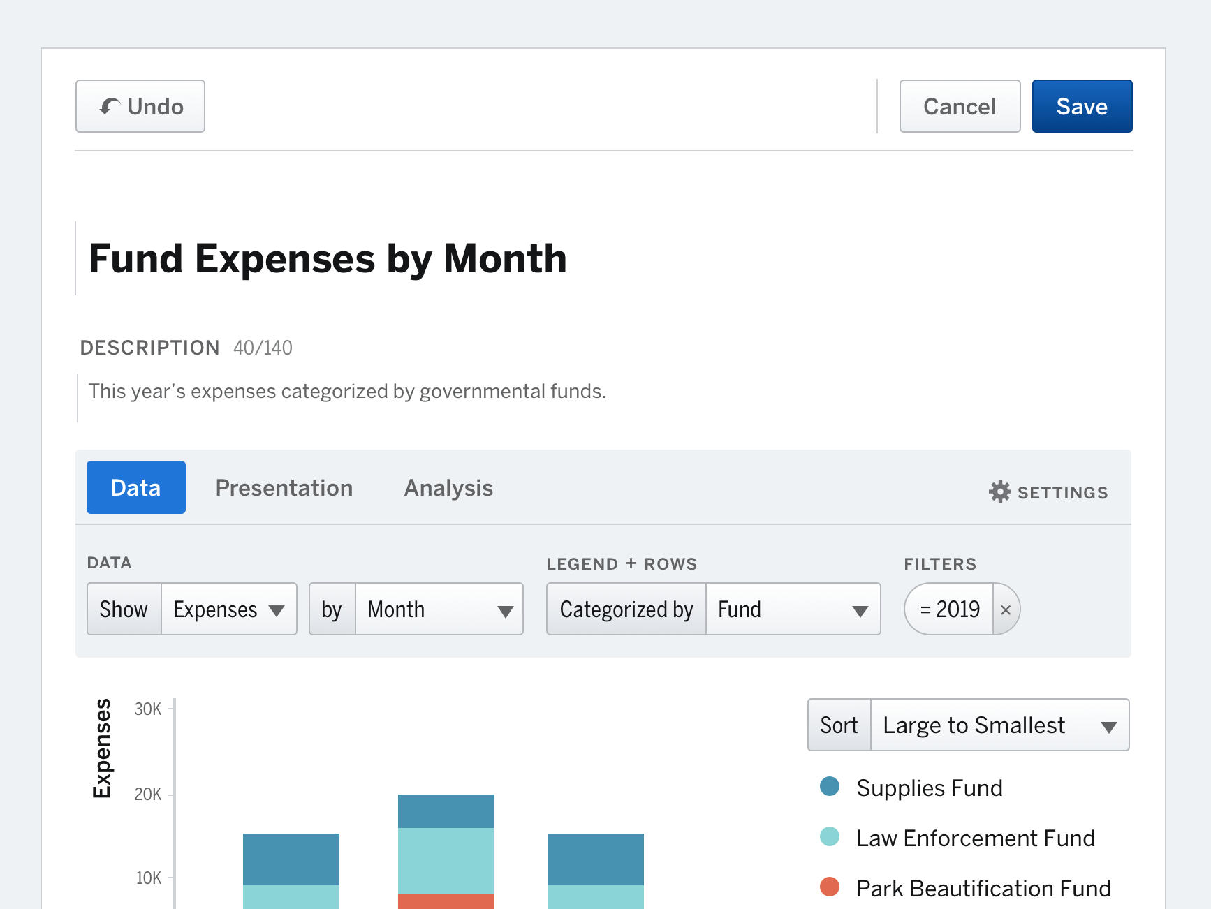
To address understandability we tried out different composition and language models, ultimately developing a mad-libs approach.
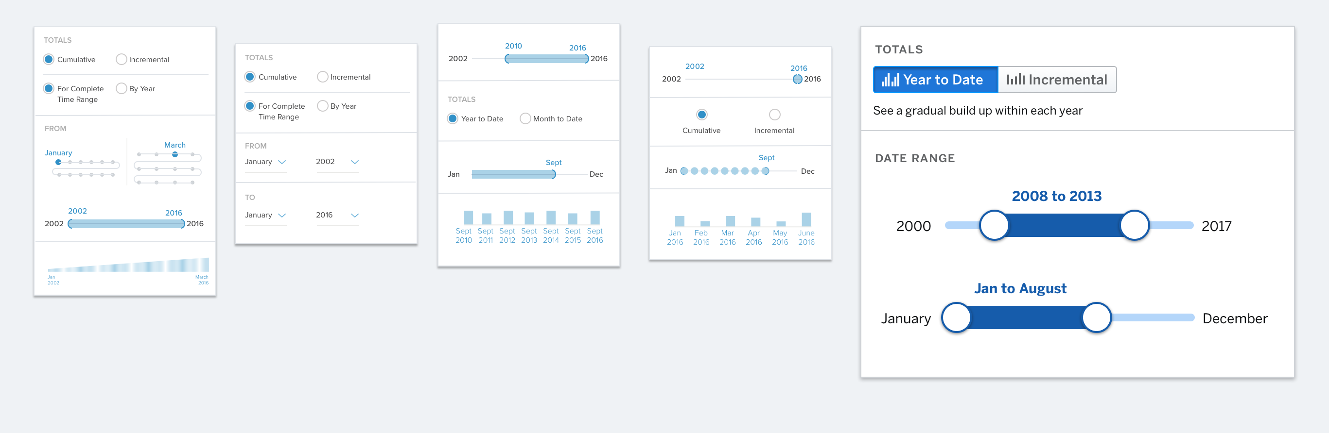
Time Travel
We teased out that time and summation was connected in the minds of users, but the exact interaction wasn’t clear without extensive prototypes.
Results
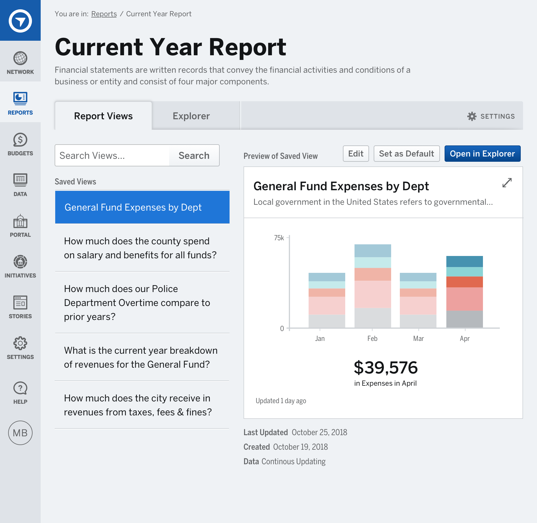
Composition with a mission
We introduced a clearer hierarchy and more traditional, top-to-bottom, information architecture. Content followed more of an “F-shaped” pattern.
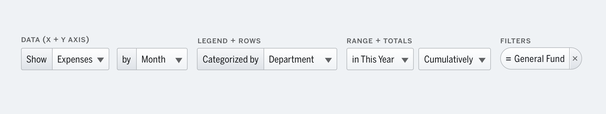
Collecting Controls
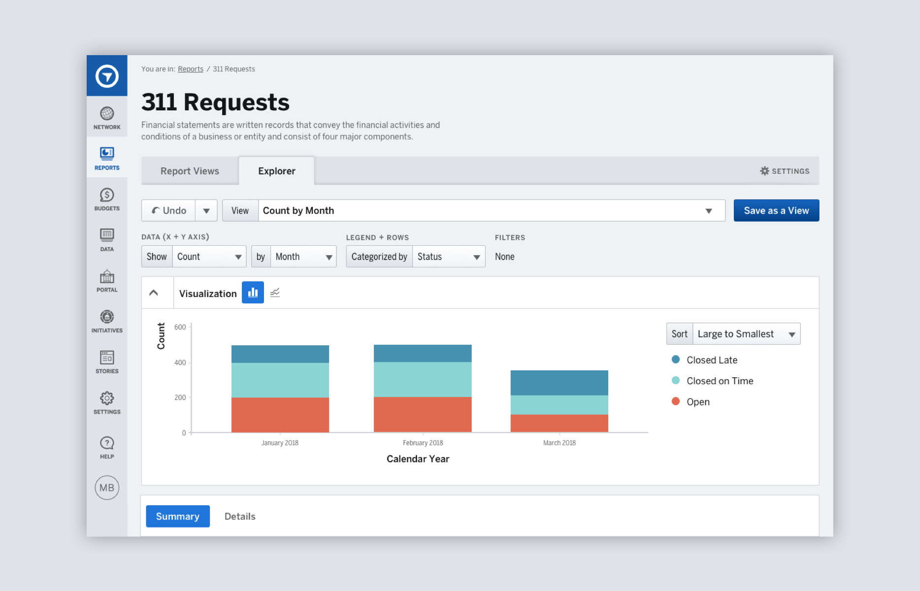
We grouped commonly used but previously scattered controls, which were now written as a sentence with language familiar to governments.
Edit? Forget it
Views were the vehicle to share insights, but there was no way to edit them. So we added an editing experience.